Designing Systems that Feel: UI/UX & Graphic Design by Yanming Chen
A long-form interview exploring process, tools, influences, and the realities of working in contemporary digital art.
By Cansu Peker
Yanming Chen is a graphic and UX/UI designer from Chengdu, China, with a Master’s degree in Communication Design from Pratt Institute in New York. Her practice bridges print, branding, and digital design, evolving from early projects in posters and typography to a strong focus on UI/UX and communication systems.
Guided by a belief that design should tell a story and not just look polished, Yanming brings together vibrant colors, minimalistic styling, and thoughtful details to create work that is both functional and emotionally resonant. Curious and multidisciplinary by nature, she often draws from illustration and animation, exploring how design can act as a vessel for emotion and a bridge between people and the objects or systems that shape their lives.
We asked Yanming about her art, creative process, and inspirations.

Can you tell us about your background as a digital artist? How did you get started in this field?
My name is Yanming Chen, and I work as both a Graphic Designer and a UX/UI Designer. I specialize in UI design and communications design, with a strong focus on solving user problems through design thinking. I studied at Pratt Institute in New York, where I built a foundation in graphic design. My earliest projects centered on print—posters, editorial layouts, and typography—but as my practice evolved, I was naturally drawn into UI/UX and branding. What has always guided me is the conviction that design should tell a story, not just look polished. That perspective continues to shape how I build systems that are both intentional and emotionally resonant, often with a minimalistic sensibility that allows subtle details to carry meaning.

You often explore emotion through design — how do you translate abstract feelings into visual language?
For me, emotions always have structure and form; they’re not abstract in the sense of being vague. I usually begin by defining the mood with words like “gentle tension” or “quiet energy.” From there, I translate those words into design decisions—through space, contrast, rhythm, and typography. I’m especially drawn to subtleties, such as restrained colors or small, precise movements. Those quiet gestures often communicate with greater depth than louder statements.
Minimalism and vibrant color coexist beautifully in your work. How do you balance restraint and expression in your compositions?
I think of it as creating rhythm. Most elements are kept clean, neutral, and pared down, which creates space for a few high-impact moments to stand out. That might be a bold color accent, an unexpected typographic gesture, or a subtle animation. When everything competes for attention, nothing resonates—so I treat expressive elements like punctuation, strategically placed for clarity and emphasis.
Can you tell us about some of your favorite pieces or a past or upcoming project? What makes them special to you?
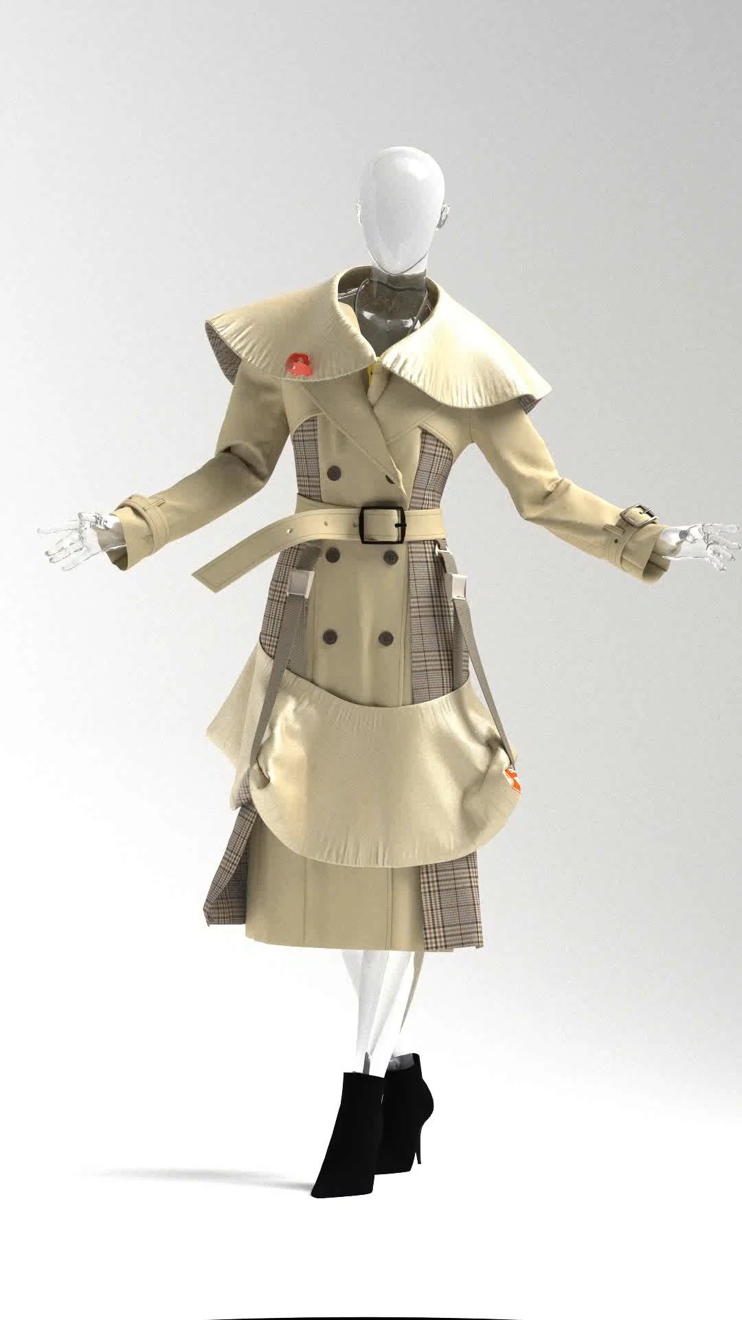
One project that stands out is Scaling Inc, one of my first identity systems. The logo was built around a polygon lattice with a hexagon center, which became the foundation for an entire design language of grids, textures, and geometric patterns. It showed me how one strong idea could expand across multiple platforms. Another important project was Bikaoci (Because), a GRE learning mini-program I developed in WeChat. It used motion and storytelling to help Chinese students memorize vocabulary. That experience taught me that even functional, utility-driven tools can feel human, warm, and emotionally engaging.

You explore emerging technologies and arts. Which recent tools or techniques have excited you the most?
Generative tools such as MidJourney and Stable Diffusion have been fascinating for me. I use them to explore visual directions and spark ideas, but they’re never the final outcome. Once I’ve clarified a direction, I move into tools like Figma or Adobe to refine and realize the work. It’s a balance of experimentation and craft, where technology becomes a partner in the creative process.
How do you see design acting as a “link between humans and objects” in today’s digital and physical spaces?
Design is the translation layer between people and the things they use. It carries human needs into interfaces, products, and systems, making them not only functional but meaningful and beautiful. Whether digital or physical, design succeeds when it understands people first—when it serves, connects, and enriches before it tries to impress.

In your design practice, you often mention the importance of combining clarity with storytelling. How do you ensure that systems such as UI or branding carry emotional weight rather than feeling purely functional?
Clarity and emotion are not opposites—they enhance each other. In my practice, I don’t treat storytelling as decoration added later; it’s part of the foundation. Everything from layout rhythm to color temperature is designed to carry tone and intention. A good system shouldn’t just help people find their way—it should help them feel something along the way.
For example, in a GRE mini-program I designed, clarity was crucial: users needed focus. But we also introduced warm colors, soft motion, and breathing-like progress animations to ease stress. The interface felt calming rather than sterile—and it showed in how users stayed longer and returned more often.
You have experimented with tools such as MidJourney and Stable Diffusion. How do these technologies fit into your workflow, and can you share a recent example of how they helped you move from exploration to a concrete design direction?
These tools are like visual sketchbooks—I use them in the early stages to explore atmosphere and composition quickly. They help me test unusual visual metaphors or combinations I wouldn’t have thought of manually. But I never treat them as final output—they’re raw material.
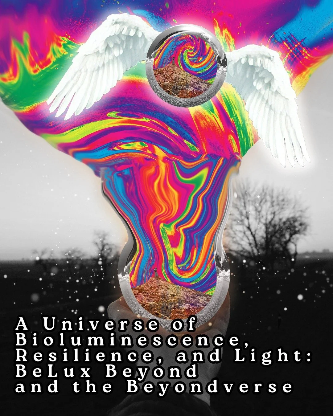
In a recent wallpaper series about “luck” and micro-rituals, I used Stable Diffusion to prototype feelings like “magnetic stillness” or “floating focus.” The AI outputs helped me define color gradients, spacing logic, and the emotional arc of the visuals. From there, I redrew part of them in Illustrator with structural clarity and accessibility in mind. The AI didn’t replace me—it just gave me more directions to react to.

Your projects, from identity systems to learning applications, emphasize design as both useful and meaningful. Looking back on a recent project, what specific change in user behavior or perception did you notice, and how did that outcome shape your understanding of design’s impact?
In the Korner Coffee project, I wanted to explore how graphic systems and spatial branding can shape not just perception, but behavior—even before a customer interacts with a product. The visual identity was built around a highly customized logotype and abstracted letterforms that flow like soft architecture. Everything from the signage to the paper cups carried the same typographic motif—curved, airy, slightly off-center—designed to feel both intentional and inviting.
The color palette was also deliberately restrained: soft greys, dusty creams, and gentle green accents. It created a kind of tonal quietness that made the space feel slower and more thoughtful. During testing and informal interviews, people described the brand as “intelligent,” “gentle,” and “somewhere I’d want to stay longer.” They felt calmer even in a mocked-up version of the café—before even tasting the coffee.
That moment reinforced something I deeply believe: design doesn’t need to shout to be persuasive. When tone, rhythm, and material coherence align, people form emotional expectations intuitively. In this case, the identity system didn’t just decorate a space—it shaped how people imagined their time inside it.


Are you our next spotlight artist? Submit the form to apply to be featured!
We share works by digital artists as well as digital arts exhibitions, events, and open calls daily on Instagram — follow us for more and subscribe to our newsletter so you don’t miss new blog posts.
![Project Spotlight: pifmgr.dll’s [M]ETAL✨ @pifmgr.dll is a digital artist working at the intersection of audiovisual design, 3D experimentation, and atmospheric world-building. His project [M]ETAL explores metal both as a physical material and a](https://images.squarespace-cdn.com/content/v1/63b2fdbe4376de5bfdc6771f/1779108338452-QO04Q3MMJ3VMU8PJV1MD/image-asset.jpeg)