

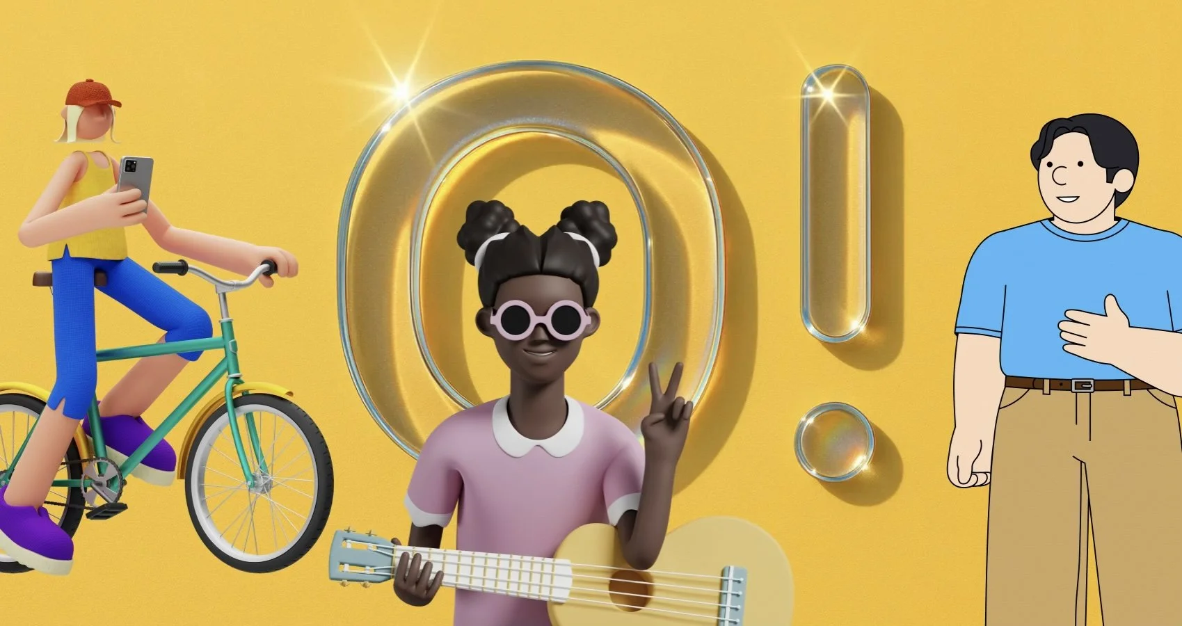
Ouch by Icons8: an expert review for teams that ship
By Jessika Kappel
What you actually get
Ouch is a curated catalog of vector and high‑resolution raster artwork. Think complete styles rather than one‑off pictures. You browse by style, topic, and use case, then download in SVG for editing or PNG for drop‑in use. Each style is a coherent system with consistent line weight, color logic, and proportions, so banner art, empty states, onboarding, and help pages feel like they belong to the same product.
The library covers product scenes, characters, abstract shapes, marketing hero art, and tiny spots for tooltips. Many items include multiple states or variants. You can recolor vectors, combine them, or crop them without quality loss. PNG sizes are large enough for Retina displays, so social posts and emails stay sharp.
Why this matters for real projects
Random art looks cheap. Systems create trust. If your product has one illustration style on the homepage and a different one in onboarding, users notice. With Ouch you can keep a single voice across product, website, social, and ads without hiring an illustrator every sprint. You can start with a style that matches your brand tone, then build a small library of reusable scenes and spots.
Formats and workflow
SVG is the main event. It is vector, so it scales cleanly. You can edit colors and shapes in any design tool that supports SVG. You can even ship it inline in HTML and style parts of it with CSS.
PNG is the fast path. Drag, drop, done. Use PNG for email clients that strip SVG, or for social networks that expect raster files. Keep a naming convention that reflects page or component ownership to help search in your repo later.
Tip for teams. Store your chosen packs in a shared folder with a README that lists what goes where. Document color overrides and dos and don’ts. Treat it like a mini design system.
Accessibility and performance
Illustrations are not just decoration. They must be accessible and fast.
Contrast. If the art includes text, respect WCAG 2.2 minimum contrast ratios. Body text should be at least 4.5 to 1. Large display text has different thresholds. The W3C Understanding docs explain the criteria in detail. See the WAI resources on contrast and decorative images for guidance.
Alt text. For <img> use concise alt text when the image conveys information. Use empty alt for decorative images so screen readers skip them. Inline SVG is different. Provide a <title> for a short accessible name and <desc> for longer descriptions.
Weight. Images are often the heaviest asset on the page. Keep bytes down. Use responsive sizes, compress where appropriate, and prefer vector when possible. A single oversized hero can tank your Largest Contentful Paint.
Example. Inline an SVG and provide accessible naming.
<svg role="img" aria-labelledby="heroTitle heroDesc" width="480" height="240">
<title id="heroTitle">Team collaborating on a dashboard</title>
<desc id="heroDesc">Three people arranging charts and sticky notes on a board</desc>
<!-- paths go here -->
</svg>
Further reading. WCAG 2.2 on contrast and alt decisions from WAI. MDN has clear references for <title> and <desc> in SVG, and a primer on SVG in HTML. Google’s web.dev covers image performance basics and responsive loading.
Picking a style that fits your brand
Start with tone. Friendly, serious, playful, technical. Ouch styles range across that spectrum. Narrow to three candidates that match your voice, then test each in a real screen. Drop one hero, one spot, and one empty state into your homepage, a feature page, and an in‑product screen. Ask a few people who do not know the brand to describe it after a quick skim. Their adjectives should match the ones in your brand guide.
Check these three things before you commit.
Coverage. Does the style include scenes for onboarding, success, error, update, and payment states, plus spots for titles and cards.
Range. Are there enough characters, objects, and backgrounds to avoid repetition in a long product journey.
Editability. Can you tweak palette and skin tones without rebuilding the asset each time.
The mid‑project reality check
At some point a designer will ask for “something like the homepage hero but showing reports, mobile, and team work.” You need a style with components that recombine well. Ouch styles tend to share proportions and perspective, so you can remix backgrounds, characters, and props without breaking the look. Create a small internal kit of the ten pieces you reuse most.
Midway note. If you need a quick link while you are scouting, keep this reference to the Ouch catalog: illustration.
Role‑by‑role guidance
For web designers and UI or UX specialists
Empty states. A gentle scene beats a block of text. Pair a spot illustration with a clear headline and one action. Shopify’s Polaris docs and other design systems recommend a single primary action in empty states for a reason. Ouch has many assets specifically built for empty and loading states, which keeps product screens consistent.
Onboarding. Use a small narrative sequence: getting started, making progress, success. Reuse color accents from your primary palette so the art integrates with buttons and links. Keep text near the image. NN Group reminds teams to place visuals close to the related copy to improve comprehension.
Figma and co. Import SVGs and convert them into components. Set color styles so you can flip from light to dark themes. If your product supports multiple brands, build component variants that swap accent colors.
Do not over‑illustrate. Too many pictures add noise and slow the page. Use imagery when it carries meaning, not as a default decoration.
For marketers and SMM managers
Campaign speed. You can spin up creative concepts in a few hours. Choose a style, define a small palette, and crop scenes for each placement. Keep a social‑first variant grid in your asset folder: square, vertical, horizontal. Export 2x sizes for high pixel density devices.
Brand recall. Keep a recurring character or prop in ads and landing pages. Consistency beats novelty for recognition. Test variants A versus B with the same copy and layout, only the illustration swapped. You will quickly learn which style your audience remembers.
Email. Many email clients struggle with SVG. Use PNG, compress well, and keep file sizes under common ESP limits. Use descriptive file names so colleagues can find assets later.
For developers
Inline SVG for theme control. When you embed SVG in the DOM, you can bind fills and strokes to CSS variables. That gives you dark mode and theming for free.
<style>
:root { --accent: #4f46e5; }
@media (prefers-color-scheme: dark) { :root { --accent: #7c3aed; } }
.hero [data-fill="accent"] { fill: var(--accent); }
</style>
<svg class="hero" role="img" aria-labelledby="t d">
<title id="t">Analytics hero</title>
<desc id="d">Laptop screen with growth chart</desc>
<path data-fill="accent" d="M…"/>
</svg>
Next.js and images. If you ship PNGs, set width and height, lazy load below the fold, and use modern formats where possible. Keep graphics out of critical rendering paths when they are not needed for understanding the page.
import Image from "next/image";
export default function Hero() {
return (
<Image
src="/marketing/hero-analytics.png"
alt="Team reviewing analytics dashboard"
width={1280}
height={720}
priority
/>
);
}
Performance guardrails. Treat each hero like a budget. If it weighs more than your largest UI component bundle, you are paying the wrong bill. Monitor LCP, and do not ship a giant PNG where SVG would tell the same story.
For educational institutions and educators
Course assets. You can assemble case studies that look consistent across decks, handouts, and LMS materials. Students can remix SVGs to learn composition, hierarchy, and color theory without starting from a blank canvas.
Assignments. Give a brief with a product scenario and a defined style pack. Ask students to design an onboarding sequence, an empty state, and a campaign ad using only that pack. This isolates the communication problem from illustration craft and keeps grading fair.
Licensing hygiene. Teach the habit early. Keep a credit line when required, store license receipts, and track where assets are used. That reduces legal headaches for student portfolios and school publications.
For startups and small businesses
Focus. You need velocity and consistency. Ouch gives you a ready visual language on day one. Choose one style and stick to it across site, product, slide deck, store listing, and social.
Cost control. Commissioned illustration is wonderful yet rarely feasible every sprint. A curated library fills the gap without looking generic. As you grow, you can brief a designer to extend the chosen style for unique moments.
Hiring leverage. Small teams often lack a dedicated illustrator. A product designer who knows layout and color can still deliver a cohesive brand story by working with a well‑built pack.
Strengths and limitations
Strengths
Consistent style families with enough range for full product journeys
Vector source files that are easy to recolor and recombine
Coverage for practical UI moments such as onboarding, empty, error, success, and feature explainers
High‑resolution PNGs for email and social
Limitations
The style you love may not cover a niche scenario out of the box. Budget time to composite two or three assets into one scene.
Raster exports are static. If you need motion graphics, you will animate in your tool of choice.
Unlimited choice can slow you down. Decide on a shortlist and freeze it for the current release cycle.
How to evaluate Ouch in 30 minutes
Pick two styles that match your tone.
Collect one hero, two scenes, and three spots from each.
Drop them into a homepage mock, a feature page, an onboarding step, and an empty state.
Recolor key accents to your brand tokens.
Export once as inline SVG for product, once as PNG for marketing.
Put the four screens in front of five people. Ask what the brand feels like. If the words are consistent across screens, the style works.
Licensing and practicalities
Icons8 provides clear licensing. Free use typically requires credit. Commercial plans remove attribution and lift usage limits. Always read the current license on the publisher’s site and save receipts in your brand assets folder. If your legal team needs to audit later, you will have the paper trail ready.
Final take
Ouch is a practical choice when you want a real system instead of a drawer full of mismatched pictures. The artwork is consistent, the source files are editable, and the catalog covers the moments product teams actually have to design. Use it with a light touch, pair it with strong copy, and keep accessibility and performance front of mind. Do that and your product will feel designed on purpose.
We share works by digital artists as well as digital arts exhibitions, events, and open calls daily on Instagram — follow us for more and subscribe to our newsletter so you don’t miss new blog posts.

![Project Spotlight: pifmgr.dll’s [M]ETAL✨ @pifmgr.dll is a digital artist working at the intersection of audiovisual design, 3D experimentation, and atmospheric world-building. His project [M]ETAL explores metal both as a physical material and a](https://images.squarespace-cdn.com/content/v1/63b2fdbe4376de5bfdc6771f/1779108338452-QO04Q3MMJ3VMU8PJV1MD/image-asset.jpeg)