Between Mis-Translations and Architecture: The Graphic Art of Yinxue ‘Lucy’ Zou
By Cansu Waldron
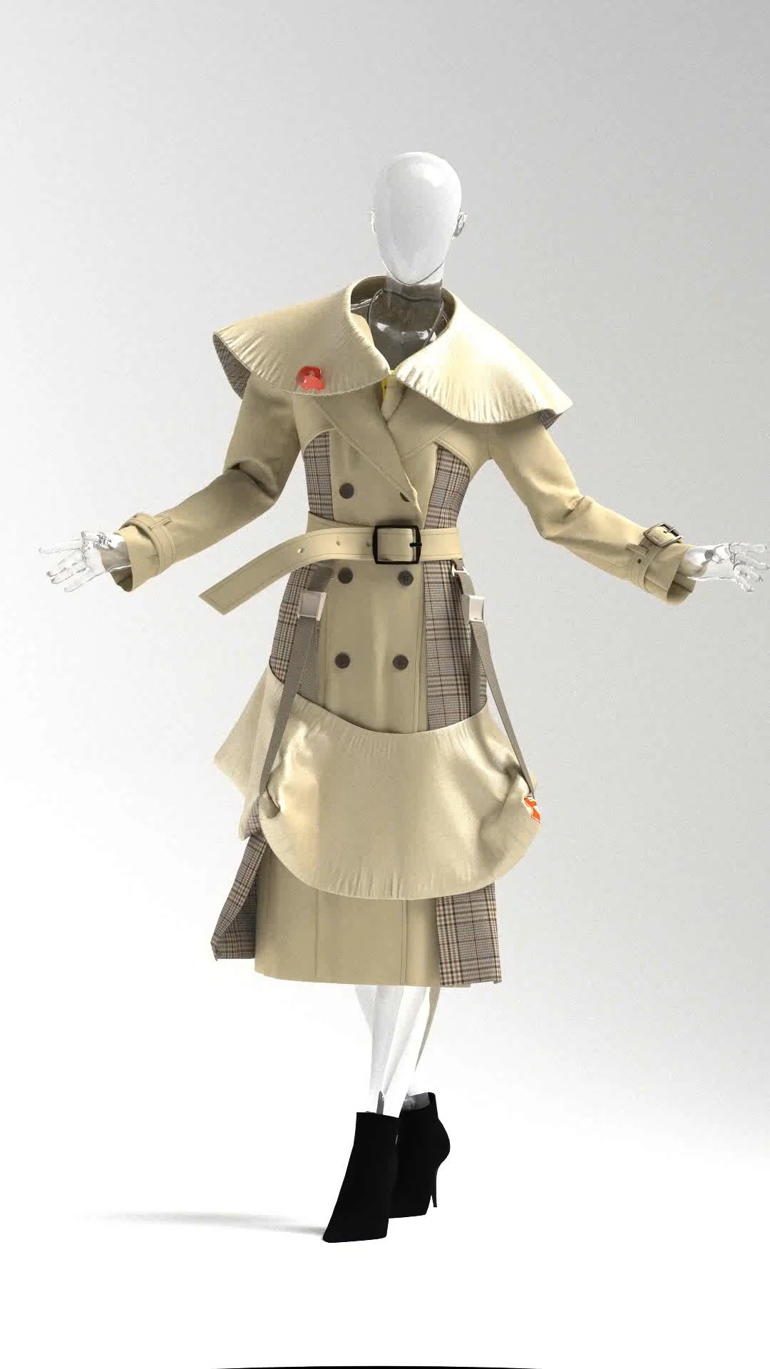
Yinxue “Lucy” Zou is a Chinese graphic designer and visual artist currently based in North Carolina, working between Raleigh, Boston, and the New York area. Originally trained in architecture, she later completed her MFA in Graphic Design at Boston University. Lucy’s practice spans experimental posters, digital collages, and artist books that explore memory, dreams, migration, and the emotional “grey zones” of living between cities, languages, and identities. Her works often combine blurred photography, layered typography, and abstract forms to create quiet, atmospheric compositions.
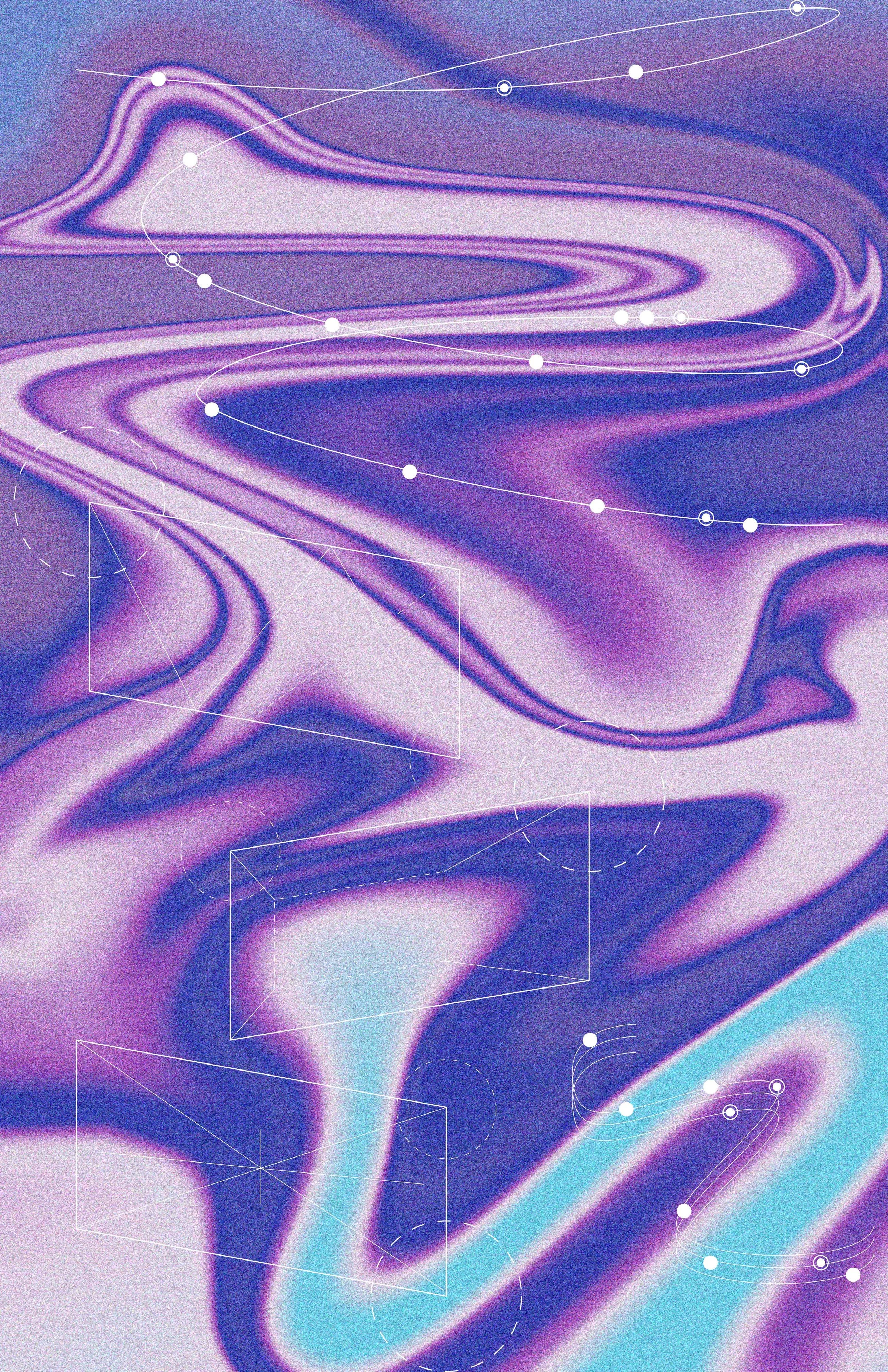
Drawing on her architectural background, Lucy approaches her work structurally, treating images like small buildings; attentive to circulation, scale, and spatial relationships, even when the resulting forms appear fragmented or chaotic. Through this lens, she maps the unstable, liminal spaces of transition, capturing the tension, humor, and tenderness of in-between states.
We asked Lucy about her art, creative process, and inspirations.

You were originally trained in architecture – how does that way of thinking influence the way you design and compose now?
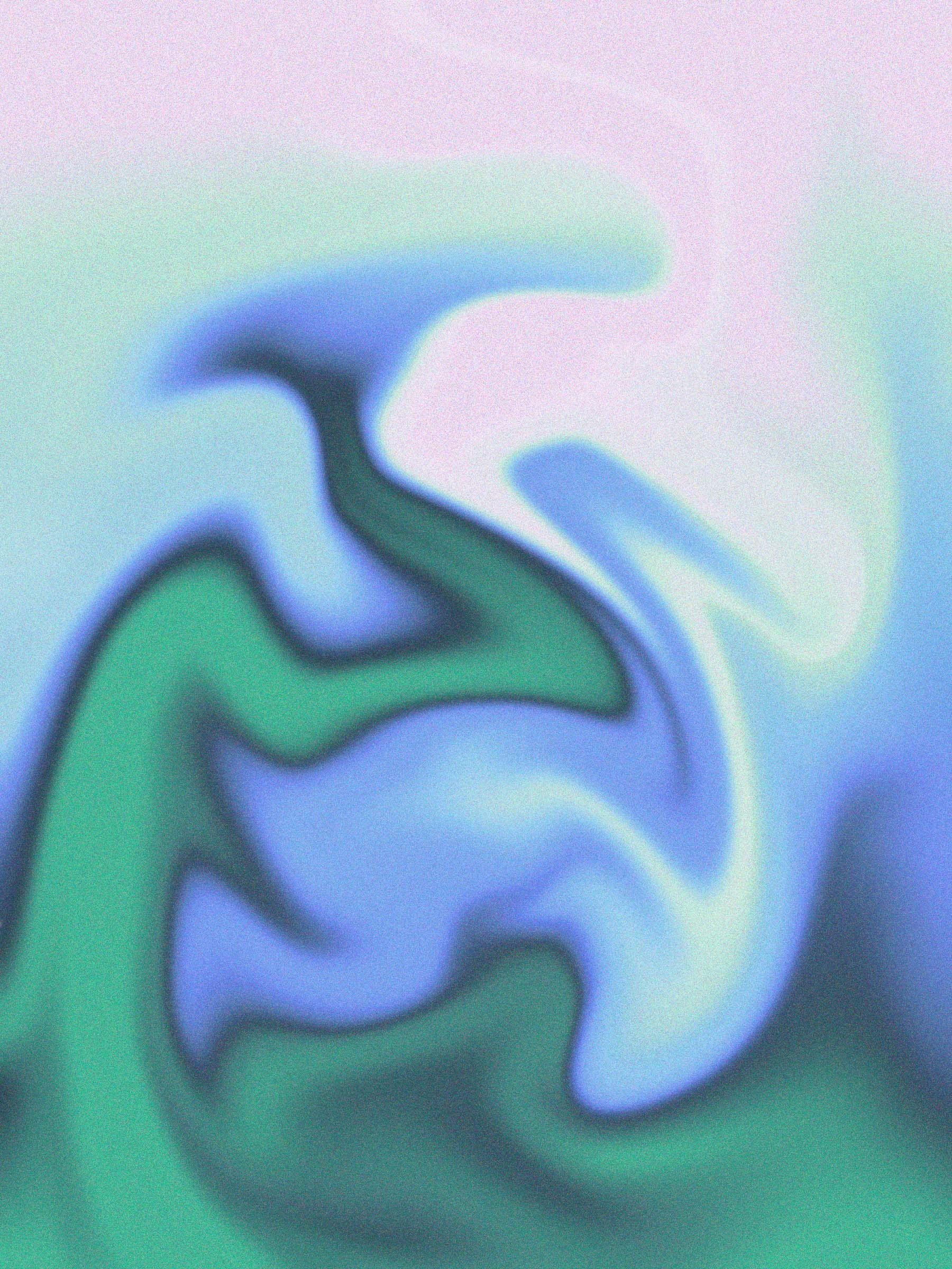
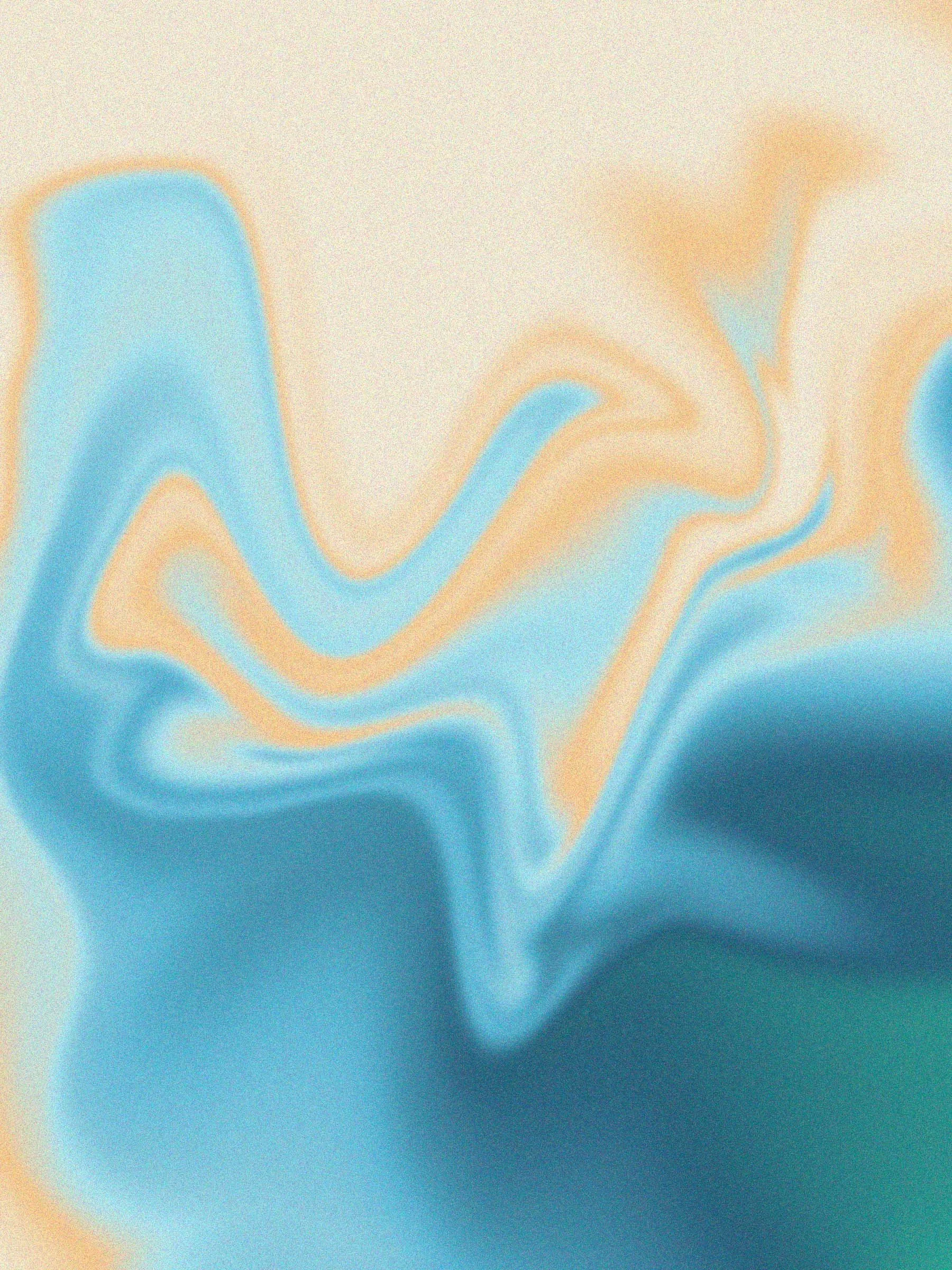
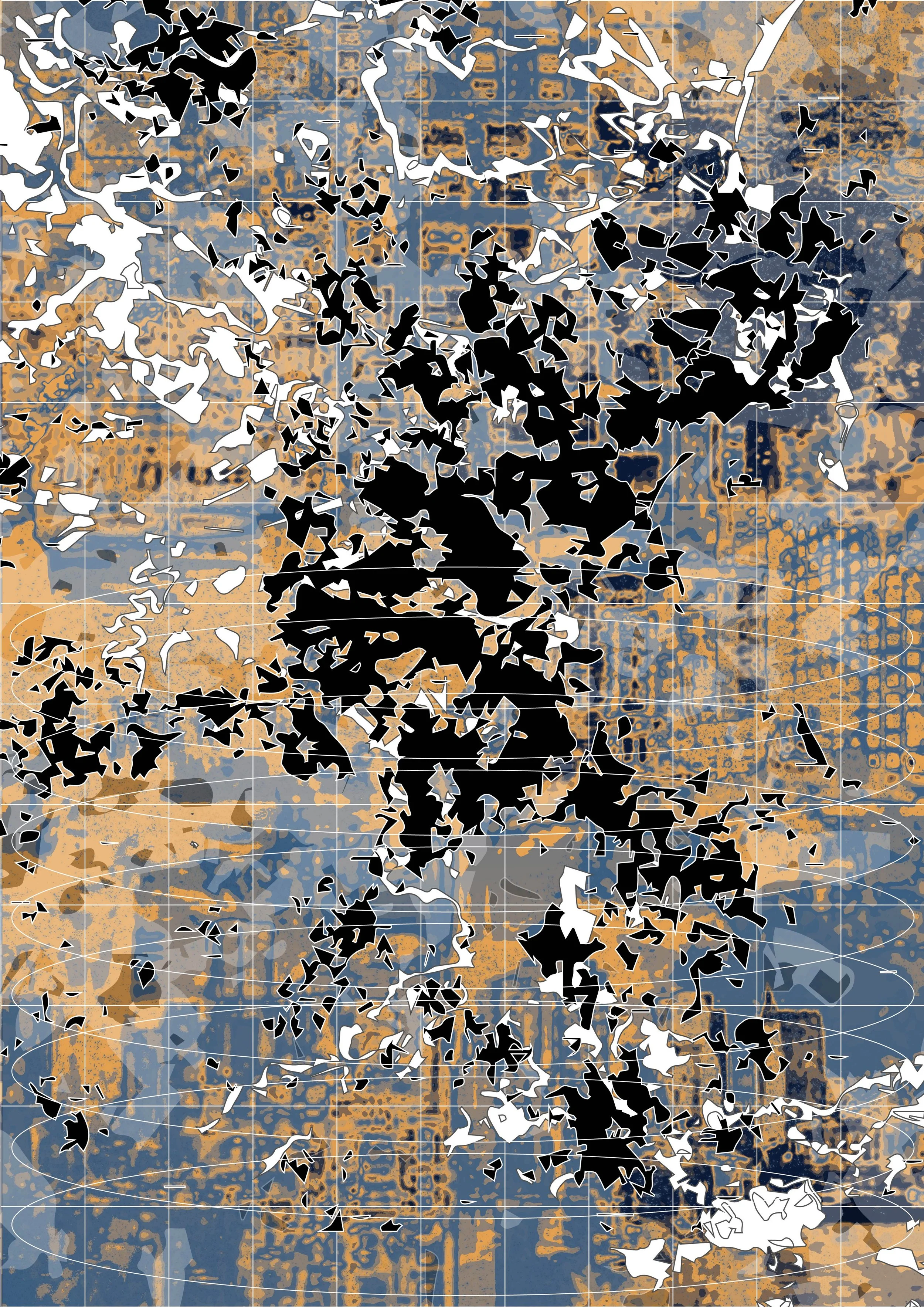
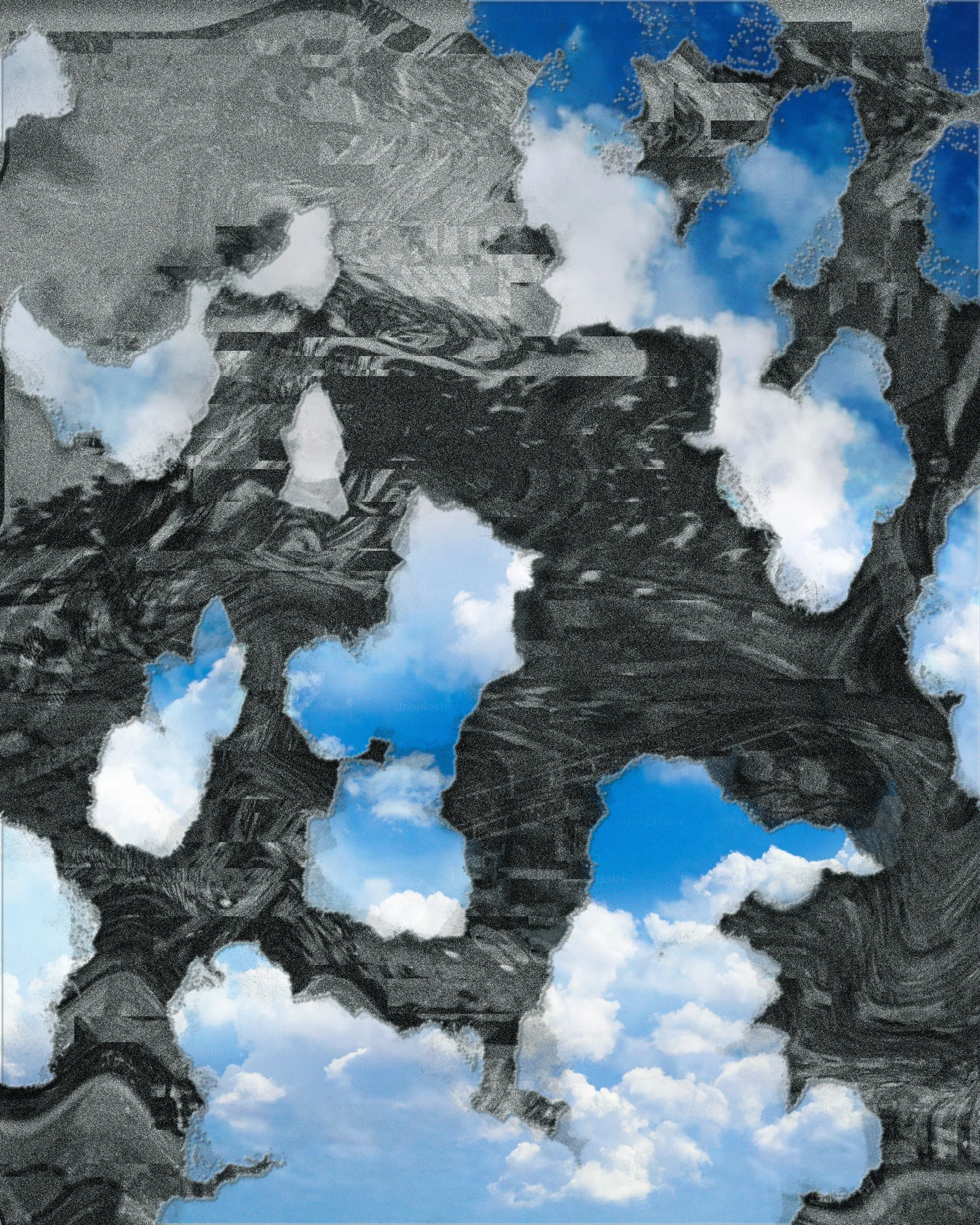
Architecture taught me to think in plans and sections, not just surfaces. I still “build” my posters like small buildings: I care about structure, circulation, and how the viewer’s eye moves through space. It also made me very detail-oriented and a bit allergic to visual noise – I prefer clarity, tension, and a logic underneath the emotion, even when the image looks chaotic at first glance. Architecture also trained my sense of scale: I’m always thinking about how close someone will stand to the work, how large text needs to be to be legible, and how different layers relate to each other in space. So even when there are rips, overlaps, or noise in the image, that “chaos” is still choreographed – it’s a controlled kind of falling apart.
What led you from architectural design to graphic design and visual art?
At some point I realized what I loved most about architecture was not the building code, but the drawing – the lines, diagrams, and narratives around space. Graphic design and visual art gave me more room to explore those ideas quickly and intuitively, through images, text, and time. I still think architecturally, but I no longer have to pretend I’m happy doing calculations all day.
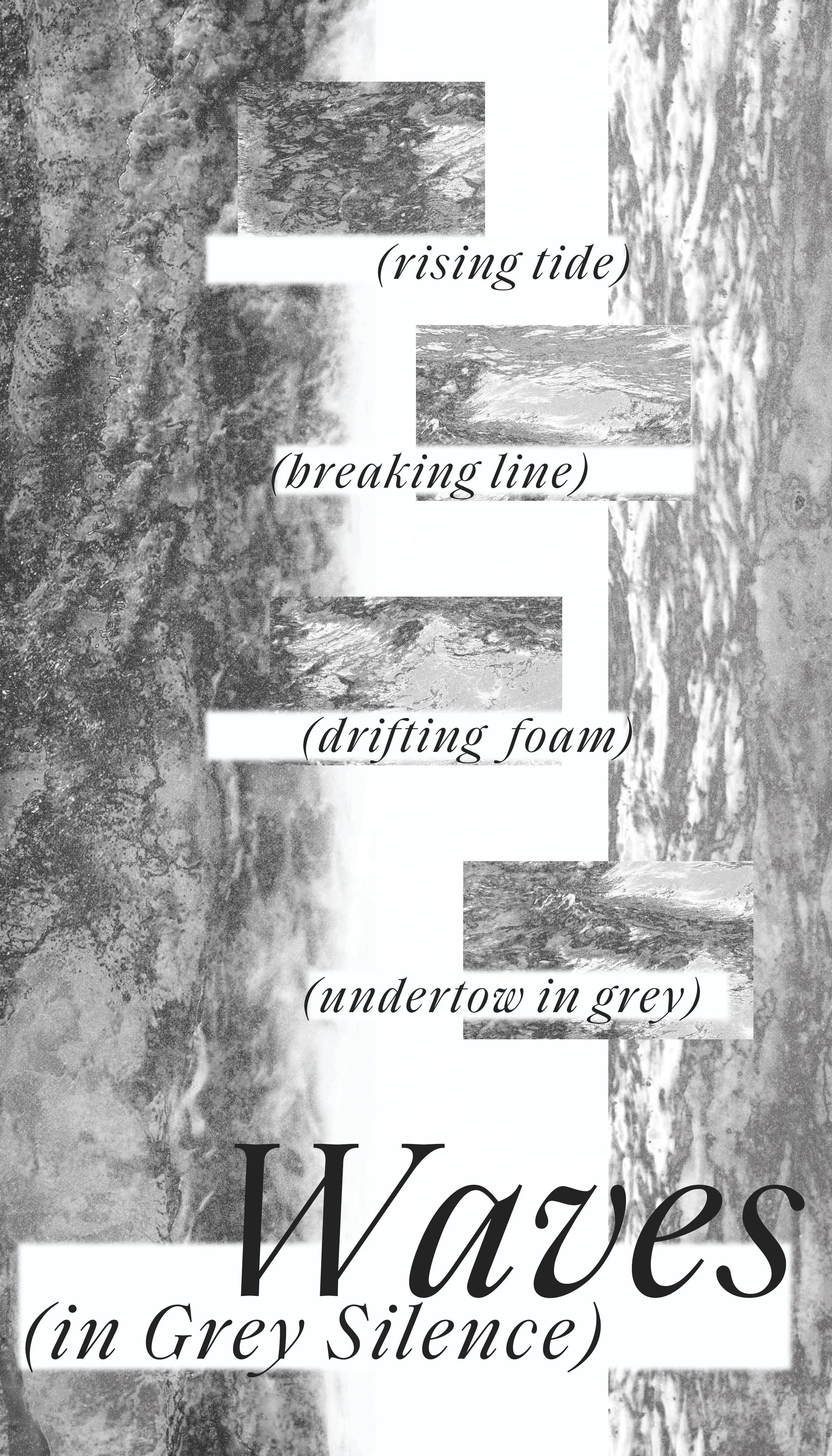
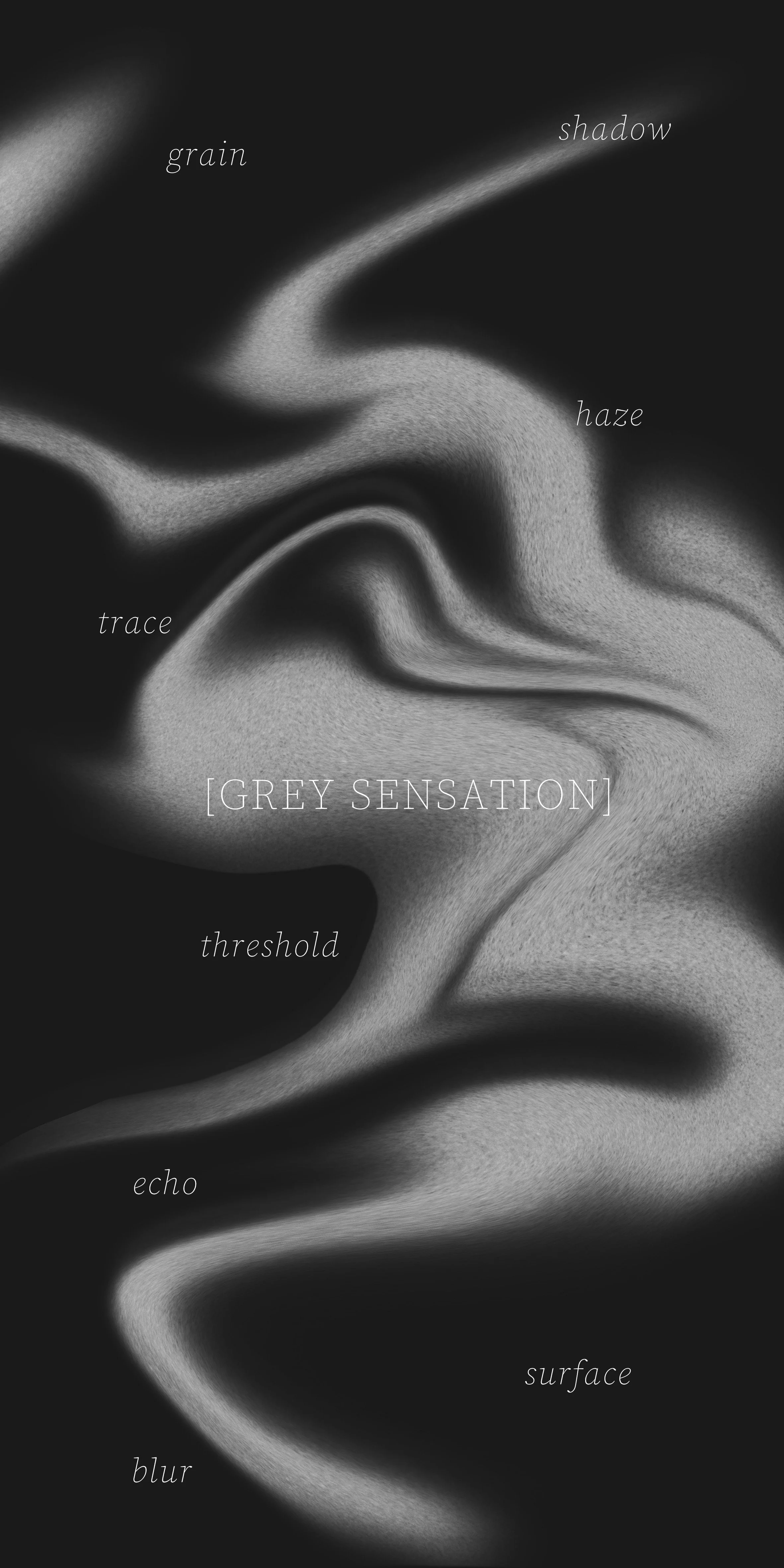
Your work often explores the emotional “grey zones” of living between cities, languages, and identities. What does that in-between space feel like for you personally?
It feels like always arriving and never quite arriving. The in-between is a little blurry, a little unstable, but also very alive – you’re constantly translating, mis-translating, and editing your own story. For me that “grey zone” is where anxiety, humor, and tenderness overlap, and my work is a way to map that feeling without fixing it too neatly.

Are there particular memories or locations that tend to reappear in your posters and collages?
Boston appears again and again in my work. I am very attached to its brick buildings, winter light, and the feeling of walking alone with headphones in a city that is both old and young. Small things like subway typography, street signs, and stairwells show up in my posters as fragments of that city.
Does working in multiple languages change the way you think about typography or visual storytelling?
Absolutely. Switching between English and Chinese forces me to think about rhythm, weight, and hierarchy differently – sometimes the meaning leads, sometimes the shape of the letters leads. I enjoy moments where languages don’t align perfectly; that gap becomes a design space. For me, multilingual typography is less about translation and more about showing what gets lost or mutated in between.

Are there any ideas or techniques that you want to try in the future?
I would like to give my posters more movement and space – to experiment with 3D, simple animation and video, like “moving collages.” I want to see what happens when the peeled layers and glitches of my static work actually move, breathe or fall apart over time. I want them to take over a room, not just hang on a wall.
If you could collaborate with another artist or writer (or even a musician), who would it be and why?
I would love to collaborate with a writer such as Ocean Vuong. His language moves across memory, migration and tenderness in a way that is very close to what I try to do visually. I can imagine a project where text and image overlap, interrupt and translate each other rather than one simply illustrating the other.
Do you have a fun or interesting fact about you that people may not know?
Because I have training in both architecture and visual communication, I can’t really “walk down the street normally.” I find myself analyzing the massing and circulation of buildings, while at the same time mentally redesigning all of their signage, wayfinding and window posters. I’m constantly thinking, “Why is this arrow here?” or “This title could look so much better.” Sometimes my friends are talking to me and in my head I’m busy art-directing the shop across the street. It’s kind of a professional habit, but it also became a nonstop observation exercise.

When you are not busy making your art, how do you like to spend your spare time?
I spend a lot of time just walking and spacing out, especially when I’m alone in a city. I like to pay attention to very small things: a patch of peeled paint on a wall, how trash accidentally forms a line on the sidewalk, or a strange flyer taped to a pole. I often photograph these details on my phone and turn them into a kind of personal archive, which later gets absorbed into my collages and layouts.
At home, my favorite way to relax is to have very long, very serious conversations with my cat, who I consider my unofficial studio assistant. She looks completely unimpressed, but I enjoy “reporting” my day to her – and sometimes new ideas appear in the middle of those monologues.
Can you walk us through your process for making a poster or collage, from first impulse to final object?
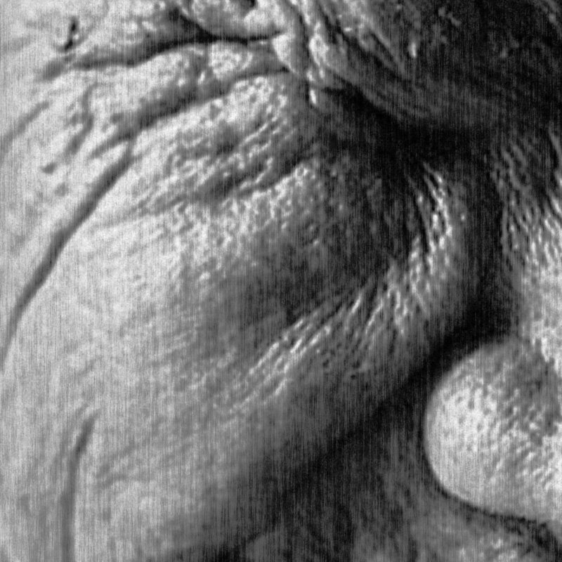
More often than not, it begins with a sentence, a mis-translation, or a small emotional glitch rather than a full-fledged image. I scribble phrases, grab references from my photo archive, and do very loose thumbnails to figure out the basic structure. From there I jump back and forth between digital and physical: sometimes I print things out, cut or tear them, scan them back in, and then layer them in Photoshop or Illustrator. I’m also interested in traces and “scars” in the file—misalignments, dust, compression artifacts—that point to it having lived in the physical world. The last step is editing: I’m always afraid of over-doing it but the key is to trust the fear and keep removing things until the image finally feels tense but breathable, like it could still shift a little if you look at it long enough.

You move between personal projects, commissions, and teaching. How do these different roles feed into each other?
They are really three versions of the same practice for me. Personal projects are my laboratory: that’s where I test out strange combinations of type, collage and narrative without having to worry if they’re “useful” or not. Doing commissioned work gives me constraints—context, audience, deadlines—that often sharpen my decisions and push me to make ideas more precise.
Teaching closes the loop. Explaining my process to students forces me to name things I normally do by instinct, and their questions often expose blind spots in my thinking. Many of my workshop exercises started as methods I invented for myself when I was stuck. So each role keeps the others honest and alive.

A lot of your work circulates digitally. How do you think about showing your pieces on screens versus in physical space?
Screens are great for reach, but terrible for scale and texture. I’m very aware that most people will encounter my work first as a compressed image on a phone, so I pay attention to the overall rhythm and legibility at small sizes. At the same time, I like to design details that only fully make sense when printed larger: subtle layers, nearly hidden text, or paper-like edges.
Whenever I have the opportunity to show physically, I treat it as a second life for the work: I might change size, paper, or finishing so the piece feels more like an object than a flat file. Long term, I’d love to push this further—let some posters become installations or time-based pieces, instead of only living as static rectangles on a screen.
Are you our next spotlight artist? Submit the form to apply to be featured!
We share works by digital artists as well as digital arts exhibitions, events, and open calls daily on Instagram — follow us for more and subscribe to our newsletter so you don’t miss new blog posts.
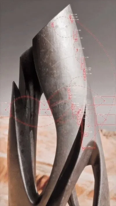
![Project Spotlight: pifmgr.dll’s [M]ETAL✨ @pifmgr.dll is a digital artist working at the intersection of audiovisual design, 3D experimentation, and atmospheric world-building. His project [M]ETAL explores metal both as a physical material and a](https://images.squarespace-cdn.com/content/v1/63b2fdbe4376de5bfdc6771f/1779108338452-QO04Q3MMJ3VMU8PJV1MD/image-asset.jpeg)