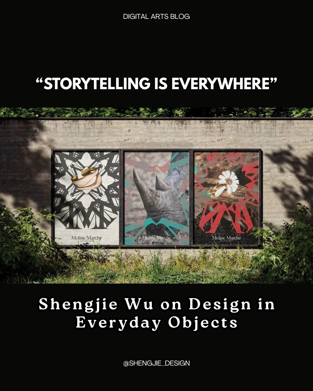
“Storytelling Is Everywhere”: Shengjie Wu on Design in Everyday Objects
By Cansu Waldron
Shengjie Wu is a designer specializing in brand identity, art direction, and book design. Originally from Shenzhen and now based in Los Angeles, he currently works at the Petersen Automotive Museum, where his interests in visual storytelling and design intersect with a broader cultural conversation around objects and mobility. Across his work, Shengjie is drawn to the idea of design as a bridge — something that can connect people, ideas, and places through carefully considered visuals.
At the center of Shengjie’s creative approach is a lifelong habit of collecting. What began in middle school with a fascination for Hot Wheels cars gradually grew into a personal archive that now includes travel magnets, printed ephemera, clothing tags, and other everyday objects. For him, these items are more than souvenirs; they’re small studies in typography, color, material, and graphic language. Paying attention to the details in objects most people overlook has shaped the way he thinks about design — informing projects that carry a sense of curiosity, observation, and storytelling.
We asked Shengjie about his art, creative process, and inspirations.
You describe yourself as a collector at heart. When did collecting start for you, and how do those objects like Hot Wheels cars, travel magnets, clothing tags find their way into your design thinking?
I started collecting in middle school, when I first became interested in cars. Hot Wheels was the first thing I collected. It wasn’t just about the cars themselves, but also the details, like color and livery.
As I began traveling with my family, I started collecting fridge magnets as a way to document each journey. Over time, collecting became more than just a habit—it turned into a mindset that fuels my creative process.
It trained me to pay attention to details in everyday life. For example, I’m drawn to the clothing tags—objects that are usually discarded after purchase, but they also feature unique typography, material choices, and visual language. Similarly, the graphics of the fridge magnets and liveries on cars continue to influence how I think about form and storytelling in design.
Your personal archive seems to mix everyday objects with graphic design ephemera. What’s the most surprising object in your collection, and what does it reveal about your visual sensibility?
One of the most surprising parts of my collection is a box filled with stickers I’ve gathered from events and as gifts from online purchases.
Many of these stickers feature unexpected or unconventional graphic styles, customized typography. Some are bold and chaotic, others minimal or oddly composed—but that variety is exactly what draws me to them.
What they reveal about my visual sensibility is a curiosity for expanding my visual taste. Collecting them allows me to observe different design approaches and think from multiple perspectives. Even in something as small and ephemeral as a sticker, there’s a lot to learn about how visual language can be playful, expressive, and unconventional.
You work at the Petersen Automotive Museum, a place deeply connected to design and engineering. Has being surrounded by automotive design influenced the way you approach typography, layout, or identity systems?
As both a car enthusiast and a designer, working at the Petersen Automotive Museum is truly a dream role for me. Being constantly surrounded by automotive design has deeply influenced how I think about typography, layout, and identity systems.
Every car has its own personality and story—much like a typeface. That parallel often shapes my approach to design. I think about how forms communicate emotion, how the curves and shape of a car translate into visual language, and how typography can echo those characteristics.
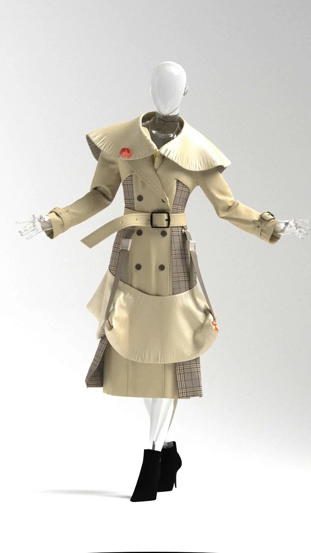
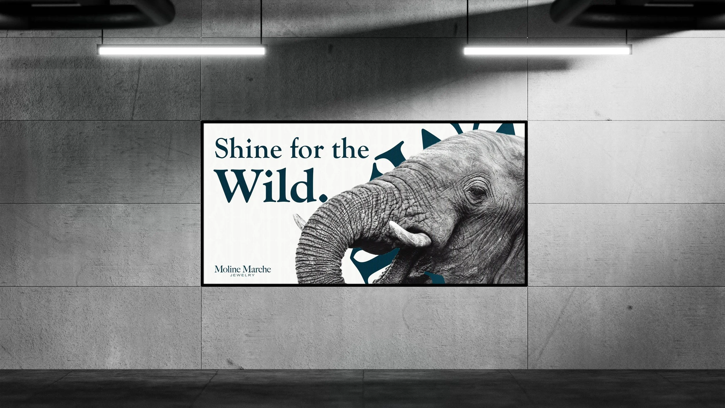
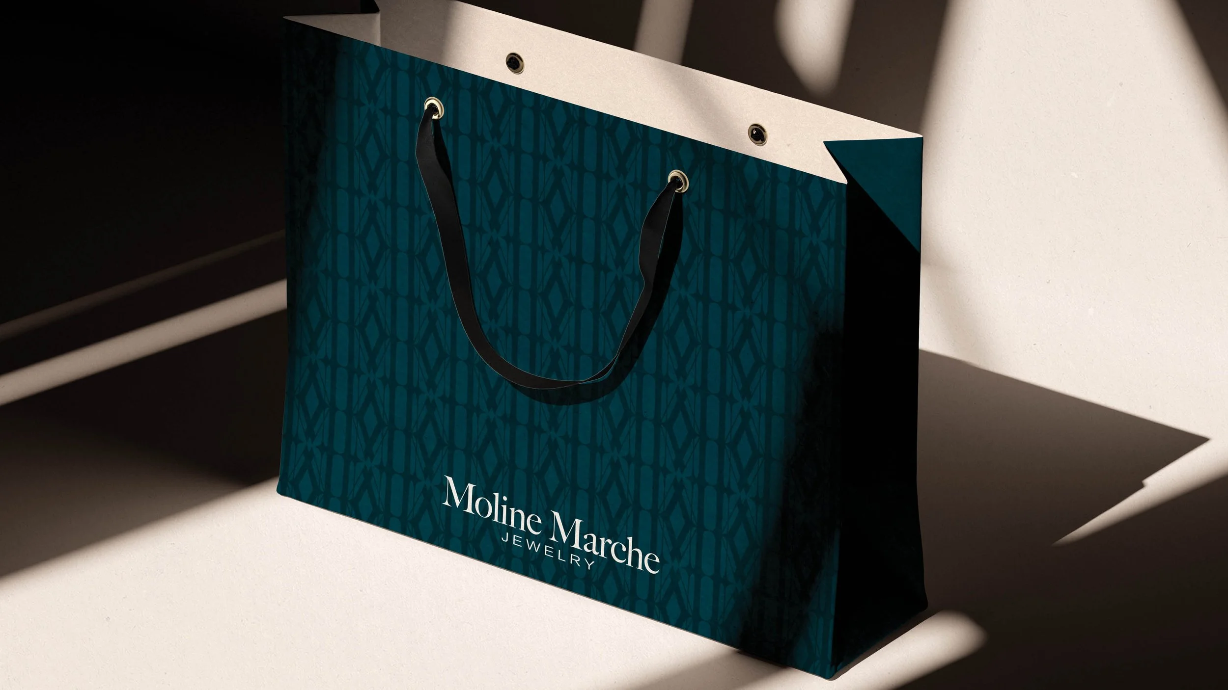
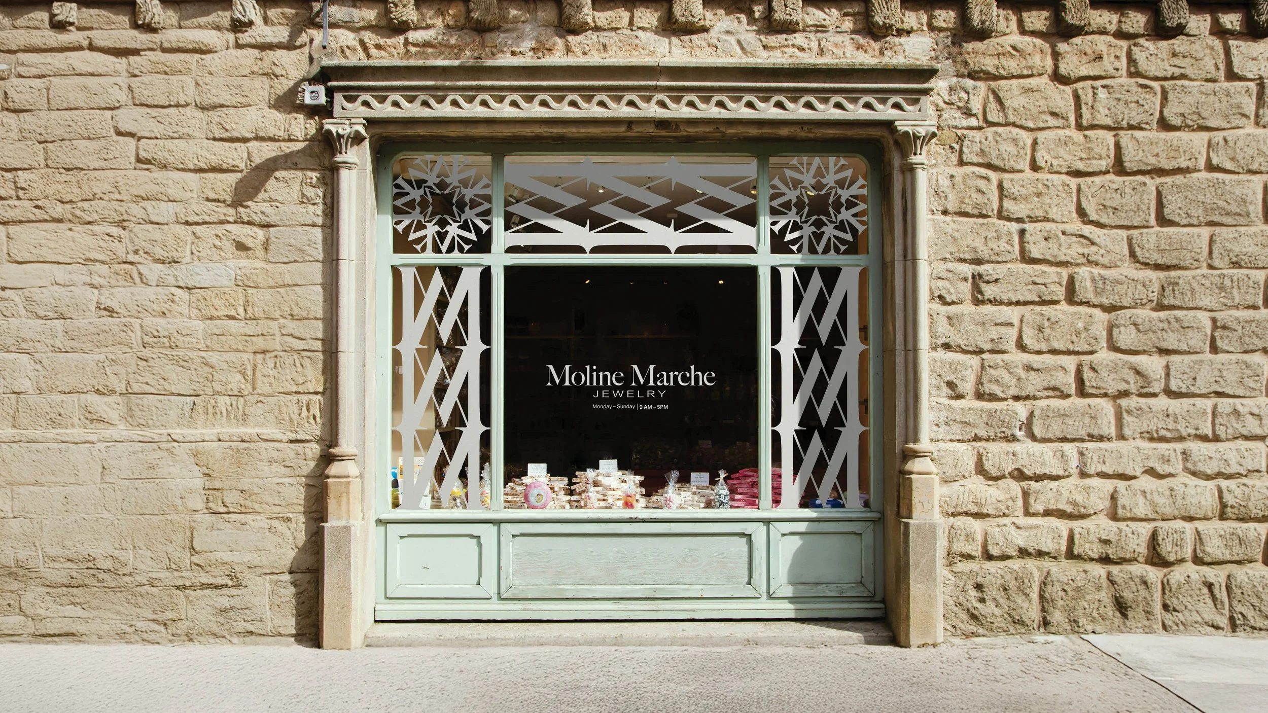
In my work, I often explore scale, composition, and negative space to build a visual narrative that draws the audience into the atmosphere of an exhibition. For example, in the “Totally Awesome” exhibition—which featured iconic vehicles from the 1980s and 1990s—our design team used bold geometric shapes and scribble patterns to create a Memphis-inspired identity system. This approach captured the playful, expressive spirit of the era and translated it into a cohesive visual experience, echoing the bold colors, sharp forms, and graphic attitude of cars from the 1980s and 1990s.
You’re interested in using visuals to connect people across cultures. Can you share a project where design helped bridge that gap in a meaningful way?
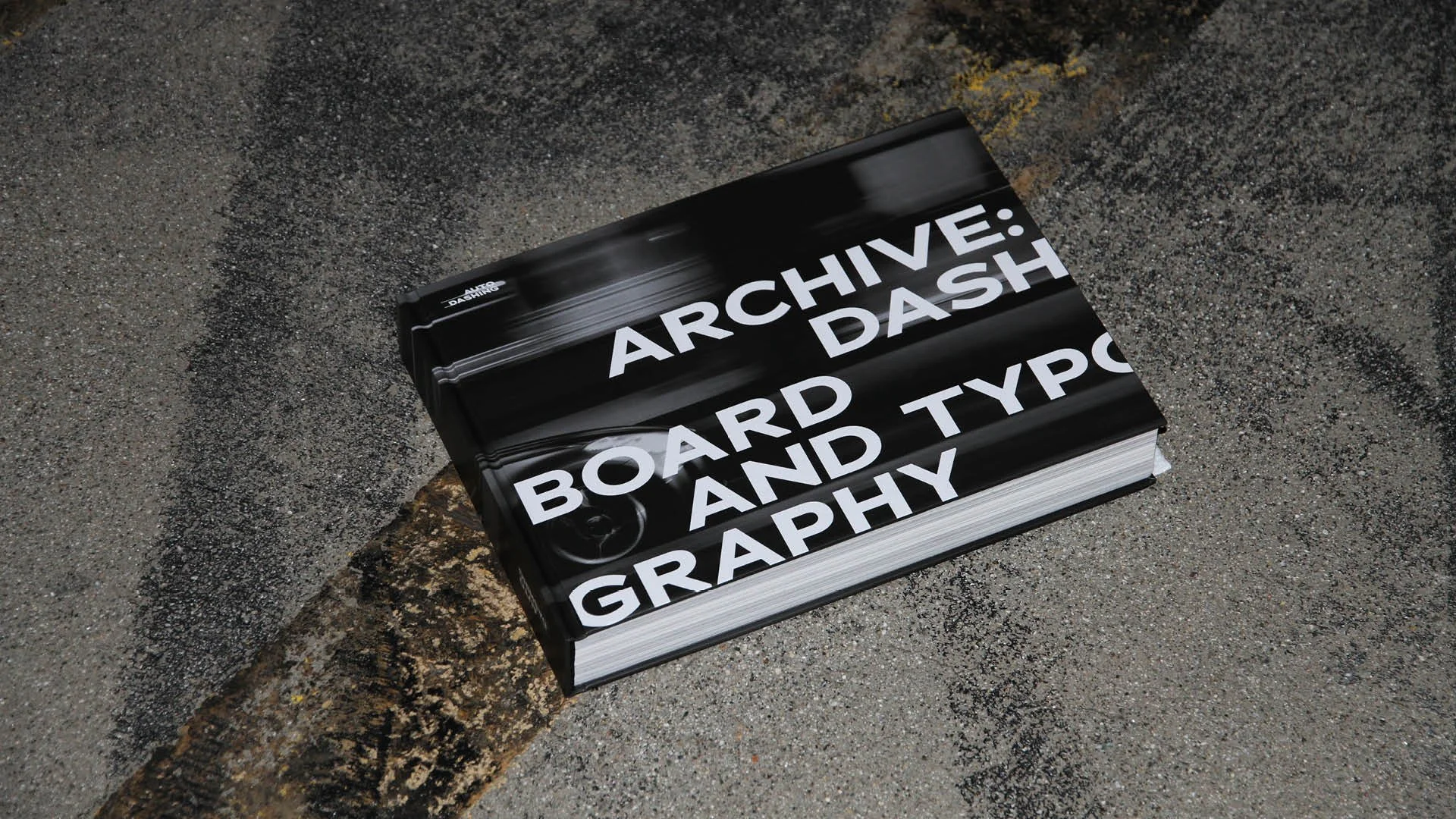
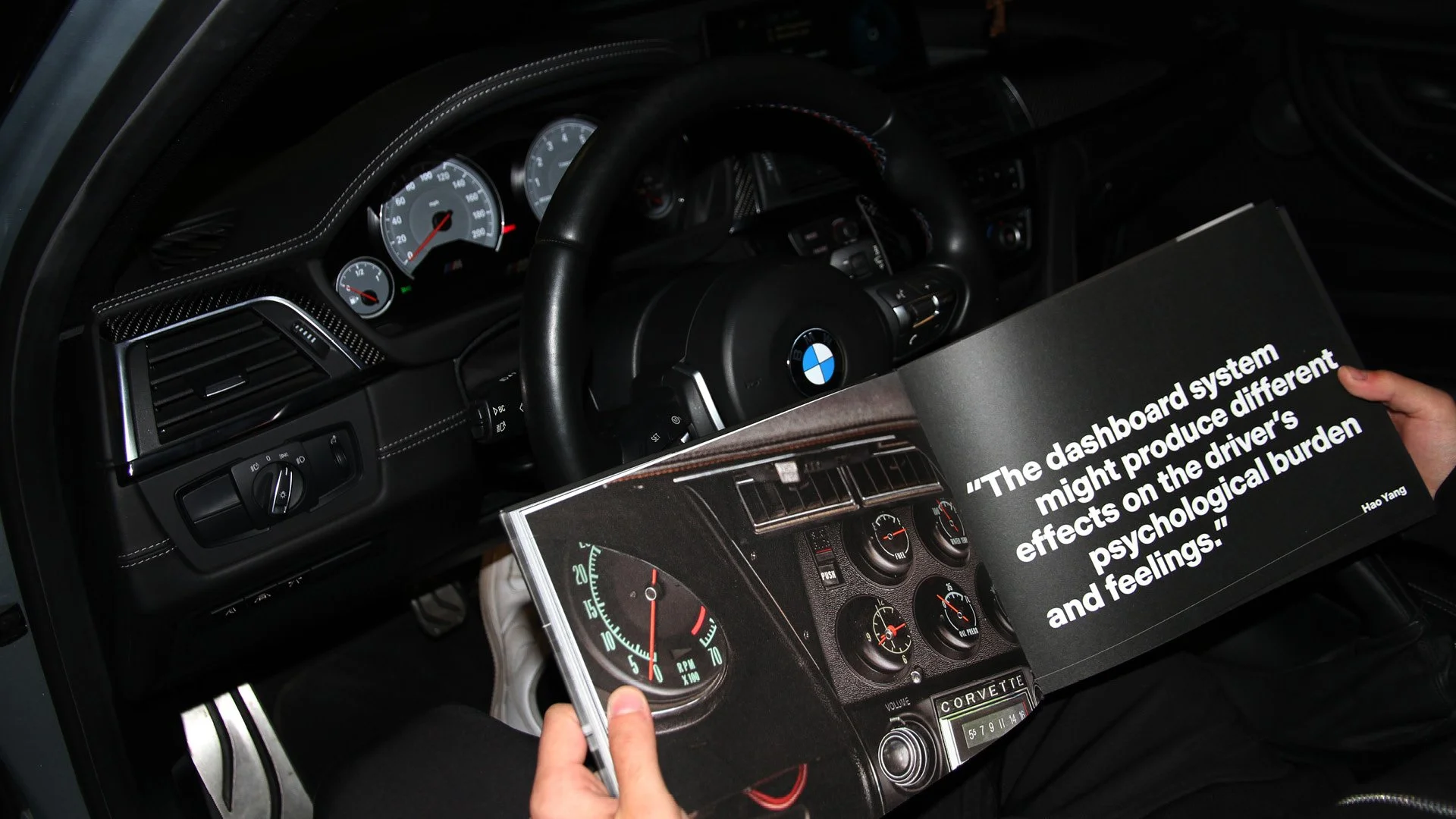
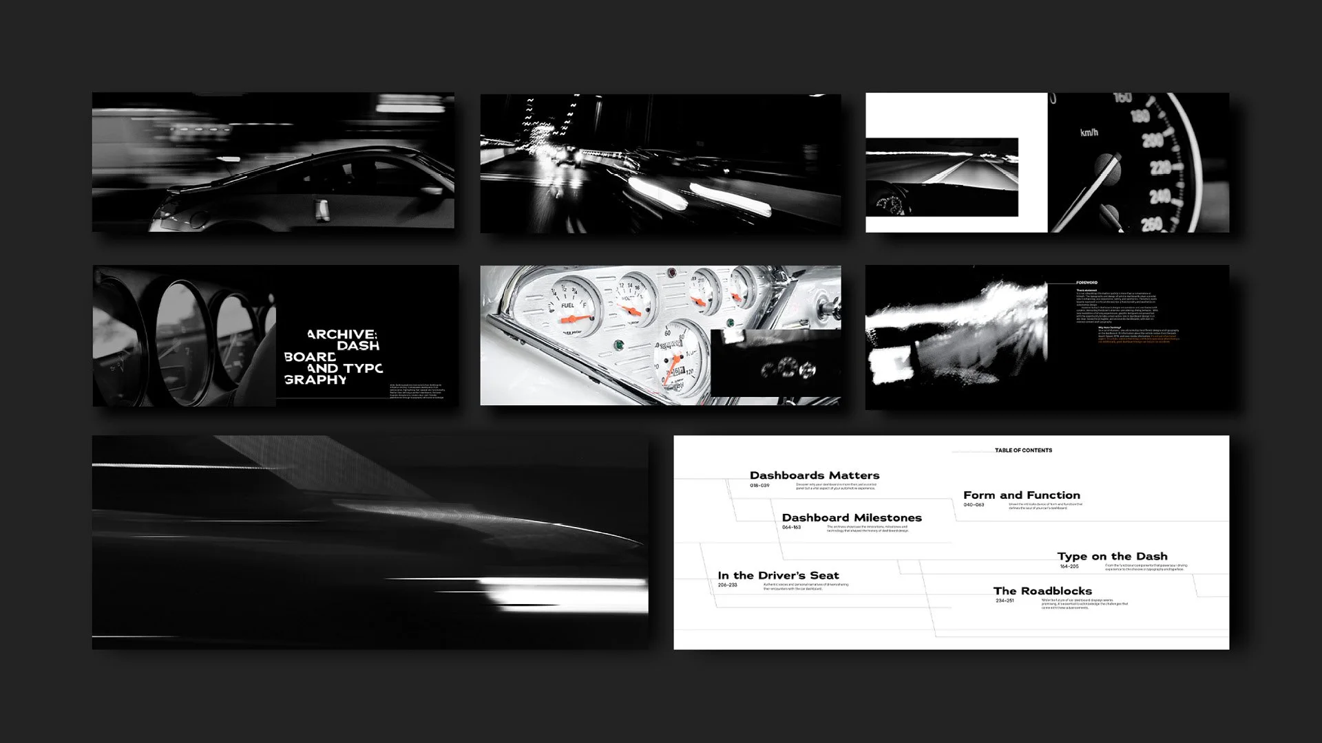
One project that reflects my interest in using design to connect people across cultures is Auto Dashing. The project explores how dashboard design can bridge the gap between car enthusiasts, everyday drivers, and the vehicles themselves.
Dashboards are the primary visual interface between humans and cars—they communicate important information in real time—yet there’s surprisingly little conversation about how their design impacts driving behavior, perception, and safety. Auto Dashing aims to bring more attention to this overlooked space.
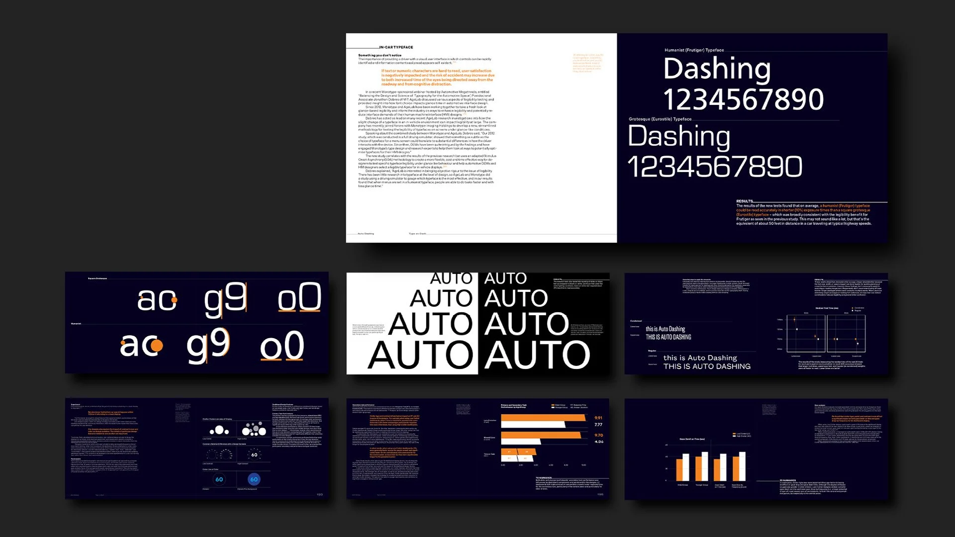
Rather than proposing a single “perfect” dashboard, the project focuses on fundamental design principles such as typography, hierarchy, and accessibility. Through a series of research studies, I demonstrate how different typographic choices—such as form, weight, and legibility—affect reaction time and readability in fast-paced driving conditions.
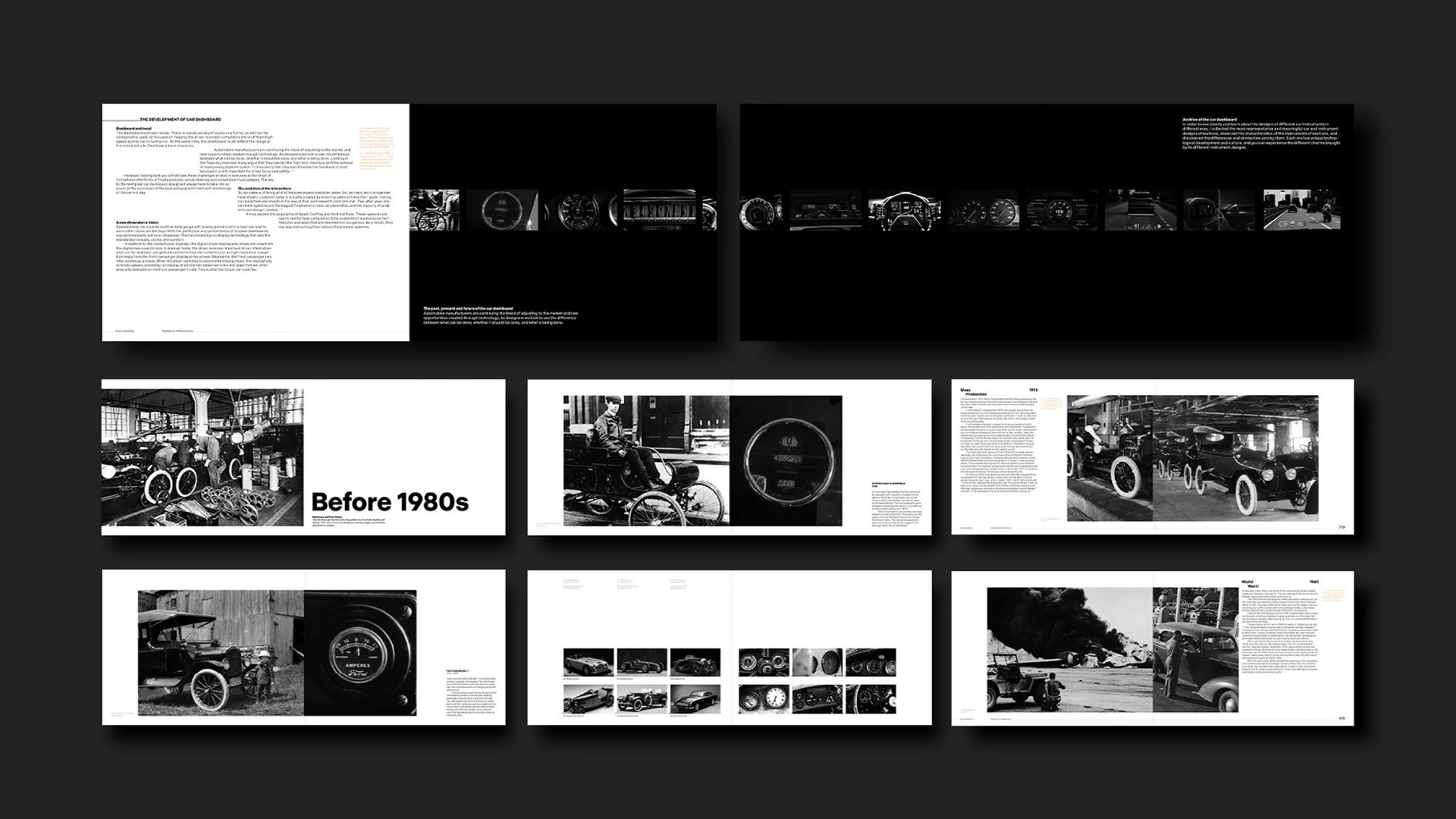
The project also includes a historical archive of dashboard designs, ranging from the late 1800s to the 2020s. By comparing visual languages across different eras and technologies, I analyze how dashboards have evolved to reflect cultural, technological, and functional shifts. This broader perspective reveals how design can create a more intuitive and universal driving experience for diverse users.
For car enthusiasts, Auto Dashing serves as an engaging archive that traces the evolution of automotive history through a single component. For everyday drivers, it becomes a resource that raises awareness of how dashboard design can directly impact driving safety.
Small details like tags, flyers, and packaging often carry a lot of personality. What have these overlooked design objects taught you about storytelling?
They made me realize that storytelling is everywhere, even in things people usually throw away. A tag or piece of packaging might be seen for only a few seconds, but it still conveys an important visual narrative. It can reflect a brand’s personality while also subtly delivering its story.
If someone opened one of your boxes of collected objects fifty years from now, what story about your life and design practice do you think they would discover?
They’d probably think I was a bit obsessed with cars and had a habit of collecting strange-looking objects. But hopefully, they’d also see a designer who found meaning in small details, and who treated everyday visuals as part of a design archive.
What else fills your time when you’re not creating art?
When I’m not creating, I often go to car meets and automotive events. I’m not only obsessed with cars, but I'm also fascinated by the car liveries, which often feature very expressive graphics and typography.
I also enjoy playing golf. It gives me a chance to step away from screens and spend time in nature, which helps me rest my eyes and reset my mind and body after long and intensive creative work.
Are you our next spotlight artist? Submit the form to apply to be featured!
We share works by digital artists as well as digital arts exhibitions, events, and open calls daily on Instagram — follow us for more and subscribe to our newsletter so you don’t miss new blog posts.
![Project Spotlight: pifmgr.dll’s [M]ETAL✨ @pifmgr.dll is a digital artist working at the intersection of audiovisual design, 3D experimentation, and atmospheric world-building. His project [M]ETAL explores metal both as a physical material and a](https://images.squarespace-cdn.com/content/v1/63b2fdbe4376de5bfdc6771f/1779108338452-QO04Q3MMJ3VMU8PJV1MD/image-asset.jpeg)